

Without the manual shutter settings, it does mean it's harder to make out contrasts and the like. However, I am also noticing that the pics look more like the models do in real life and on the table, where my earlier pics were so bright and clear that they sometimes looked better painted than they really were. So for my purposes today, the new camera works better. Also remember that each picture can be clicked on for a larger view.
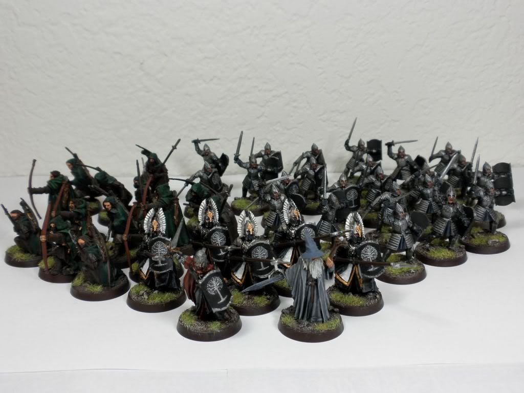 So this is the overall army. My general painting style tends to be subtle, and on the whole I think this looks pretty good on the table. The earthier tones holds it all together, and there is a lot of black and brown. The individual groups definitely tie together - green for the rangers, a blue/grey for the warriors, white for the Guards, and red for Ecthelion.
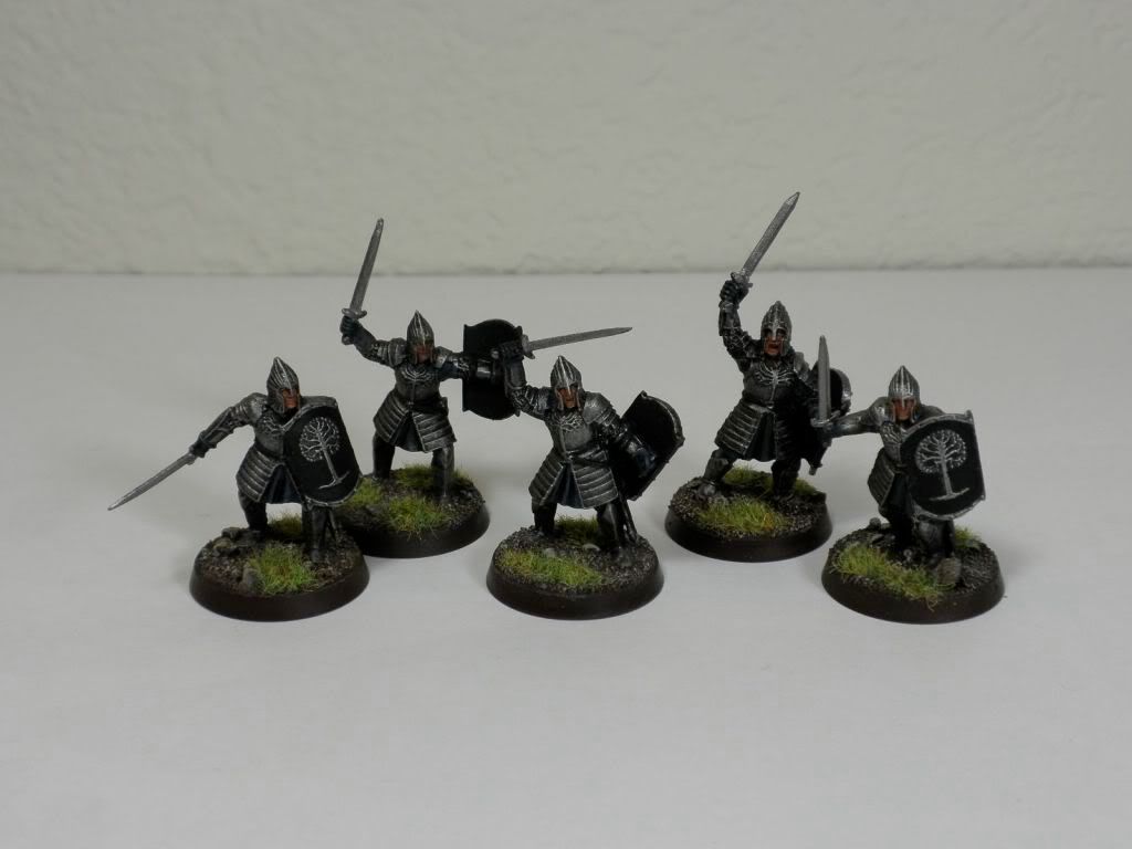 Where this starts to fall apart is in the details. OK, that and I didn't put enough time into painting last time. I'm afraid I'm going to need to step the highlighting up - believe it or not that is three layers and a wash on the cloth, but the low steps in color make it all wash together, resulting in a less highlighted effect. I also need to highlight the details like the belts, hair, and possibly even the armor and hair. Some blacklining of details wouldn't be a bad idea, either.
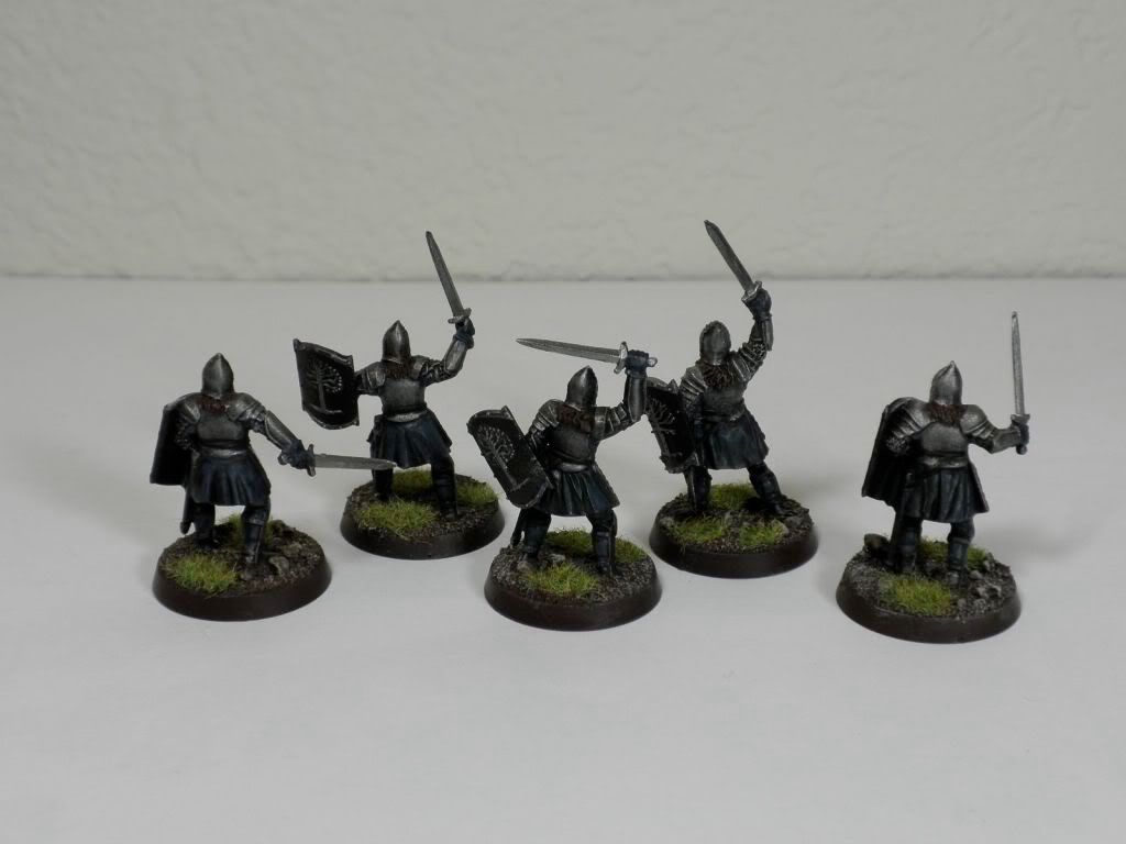 Back shot of the warriors - the cloth is a little clearer, but you can see the unhighlighted belts and hair.
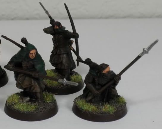 Here are the rangers. There's a little inconsistency here - I painted the metal rangers on the left some four years ago while working for GW. I don't remember the exact colors, and the foundations weren't available yet. But you can see there is better highlighting, the skin is better, and there is a broader range of colors within the palette. The browns all wash together on the newer models instead of having a more noticable line. I was really, really rushed on these guys.
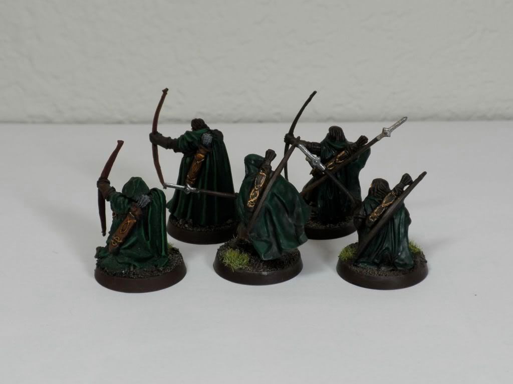 It's a little more obvious how rushed I was on the back. The old models have nice highlighting on the cloaks, while the new ones were just block painted and washed. I also didn't use any highlights on the quivers.
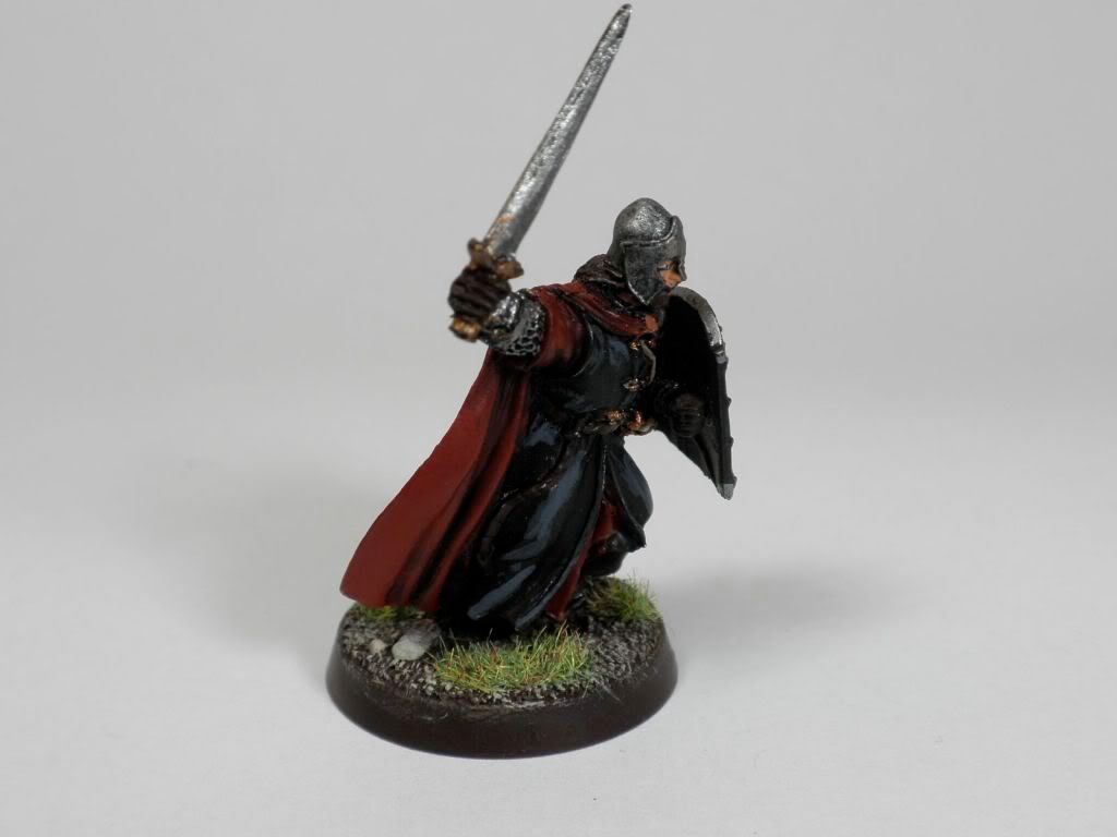
 These guys look pretty sharp from the front. That white was a pain, but the blacklining works nicely. I think I'm going to use a Micron pen to add a design on the tabard edge, and possibly put a decorative yellow and black edge on the cloak as well. Some gold details on the helmets might also work nicely.
 The cloaks are another story. Single grey highlights that look slapped on. I'm not sure if I should go down from these highlights, adding a midpoint between them and the shadows, or go even higher.
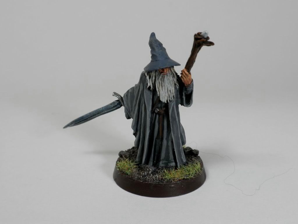 Without question, Gandalf is the best model in the army. I put a lot of time and care into painting him, particularly his hands and folds of the robe. I even highlighted the belt and swordblade.
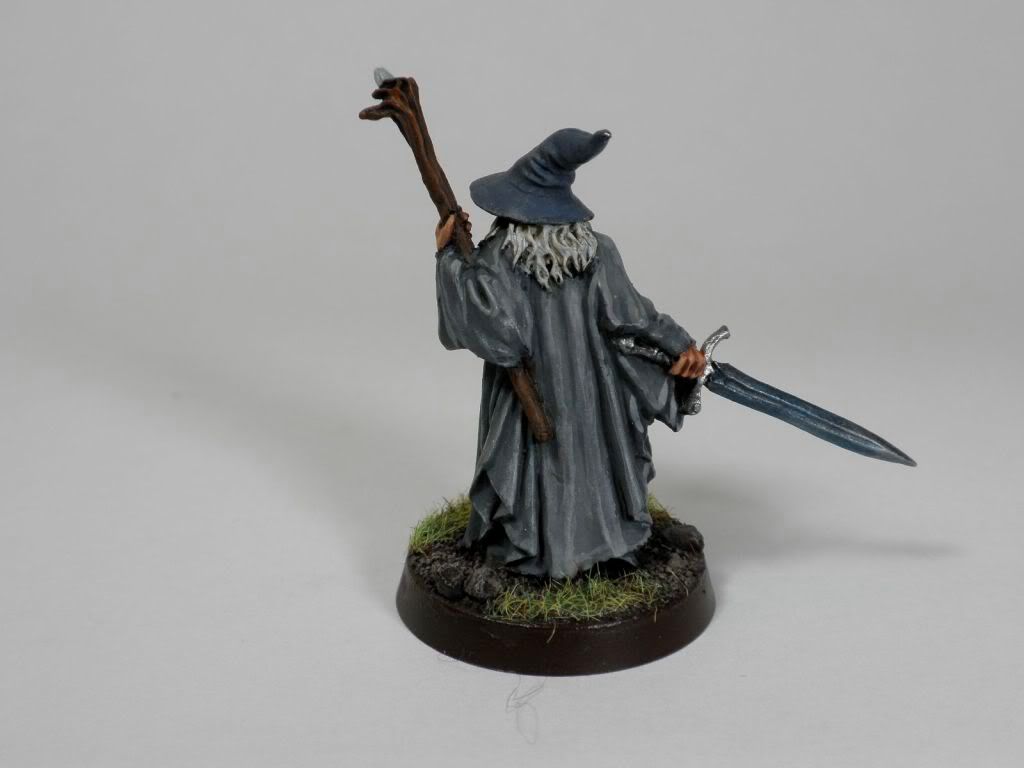 I do have a little chip on the end of the hat, but I'm a bit afraid of fixing it and causing more damage by not getting the same effect as before.
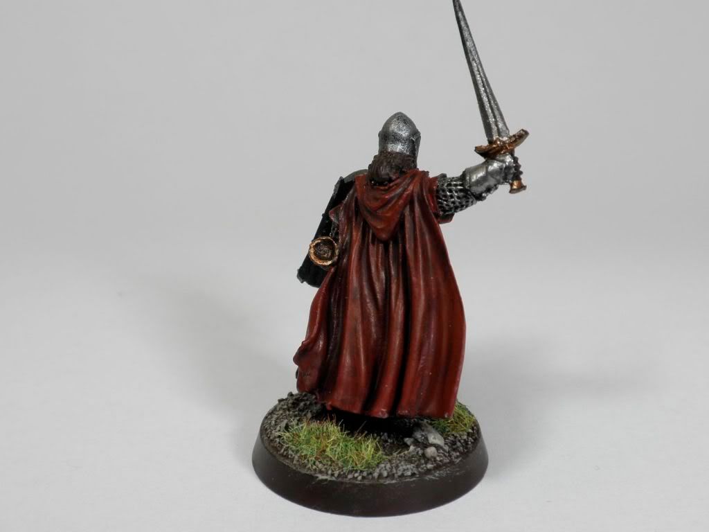
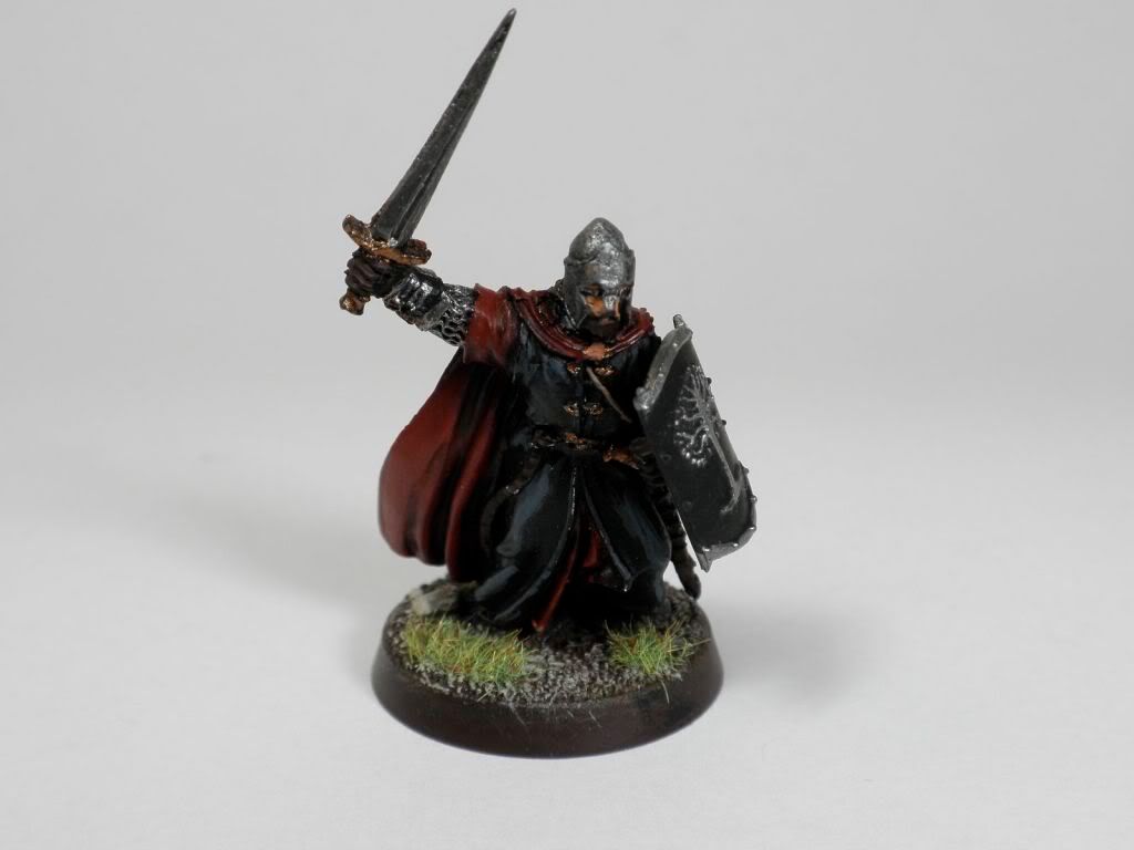 In contrast to Gandalf, Ecthelion screams "rush job". While I put some time into the cloak, it still comes off too subtle and dark. The rest of him is single, sloppy highlights, drybrushing, unpainted details, and general blah. I've got a lot of work to do here.
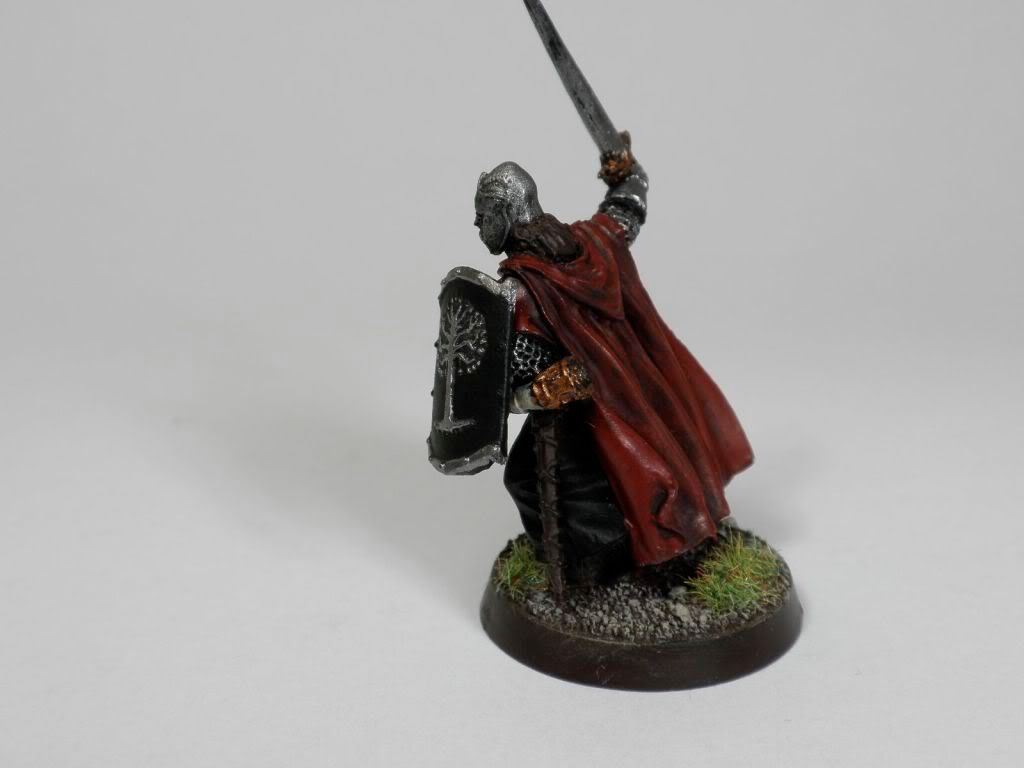
So I'm mostly wondering how much I should play up the highlights - I've always gone more subtle with my LOTR models, but I am starting to think I need to really spice it up with brighter highlights. Any thoughts? Tim K, I'd particularly appreciate your insights on this, since you scored this army at the Gathering.
Thanks a ton to everyone who has bothered to read this!
Chris,
ReplyDeleteFirst off the army on a whole looks really good, a bit dark, but good. The Darkness may be from the camera, can't be sure though.
As for the highlighting, you did a good job, but the added highlights are to starc. I mean there is no blending between the colors. I can see the base color, the first highlight and the last highlight, there is no smooth blending with it. I would suggest taking some time to blend the colors better.
Don't get me wrong, the army looks great, just the highlighting can be blended better. This would take you to the next level and higher scores.
Tim K
Tim,
ReplyDeleteI'm guessing you're talking about the highlights on the Fountain Court and Ecthelion - are there other models as well?
Yeah, the models are dark - the earlier pics actually brightened the models because I was using slow camera speeds, which overexposed them a bit. Some of my blending gets lost in the darkness, I think, particularly on models like the warriors and Ecthelion's cloak. So I'm guessing I should brighten those highlights up a little more.
I really appreciate the advice, particularly from someone who has scored them in a tournament! Keep it coming!
Chris